This tool allows you to generate a number of graphs that compare a range of metrics between the selected participants.
The available graphs include:
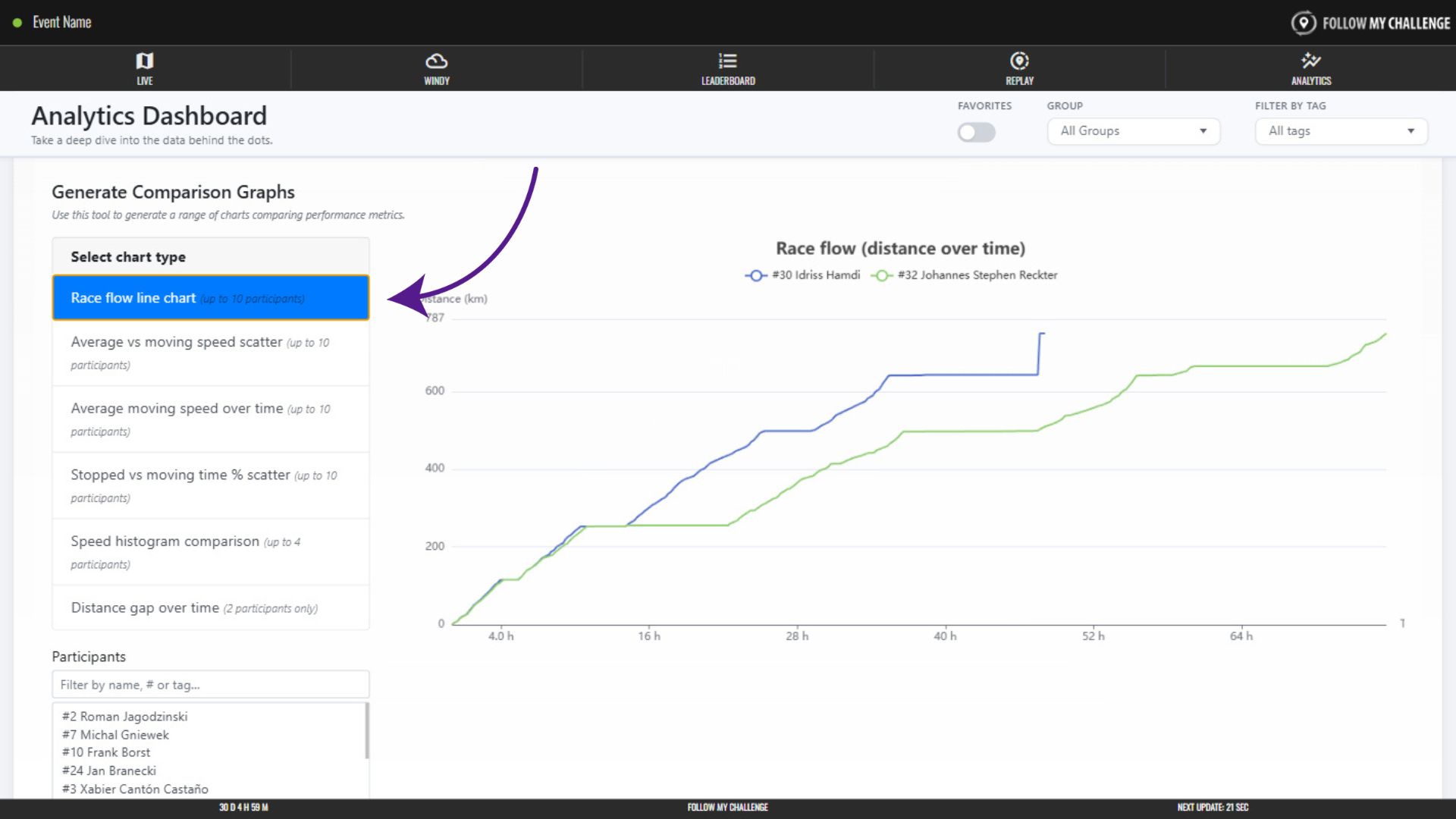
- Race flow line chart
- This show distance (y axis) over time (x axis) as a line graph
- Average vs moving speed scatter
- This is a scatter plot showing moving speed on the y axis and overall average speed on the x axis
- Average moving speed over time
- This is a line chart showing how average moving speed (y axis) has changed over time (x axis)
- Stopped vs moving time % scatter
- This shows moving time (y axis) as a percentage of total time versus stopped time (x axis) as a percentage of total time
- Speed histogram comparison
- This shows percentage of time spent in different speed zones
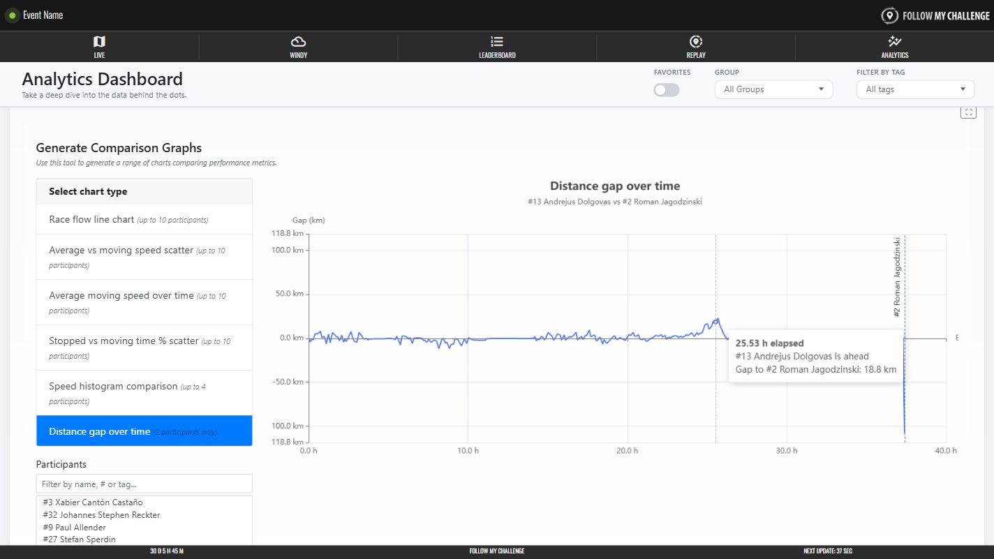
- Distance gap over time
- This shows how the gap in distance (y axis) changed over time (x axis) between two participants
Selecting Participants & Generating Graphs
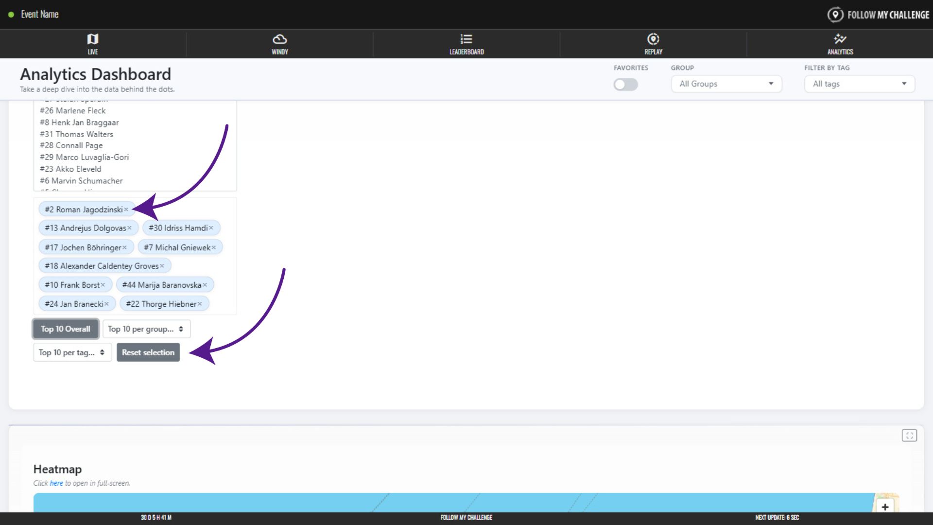
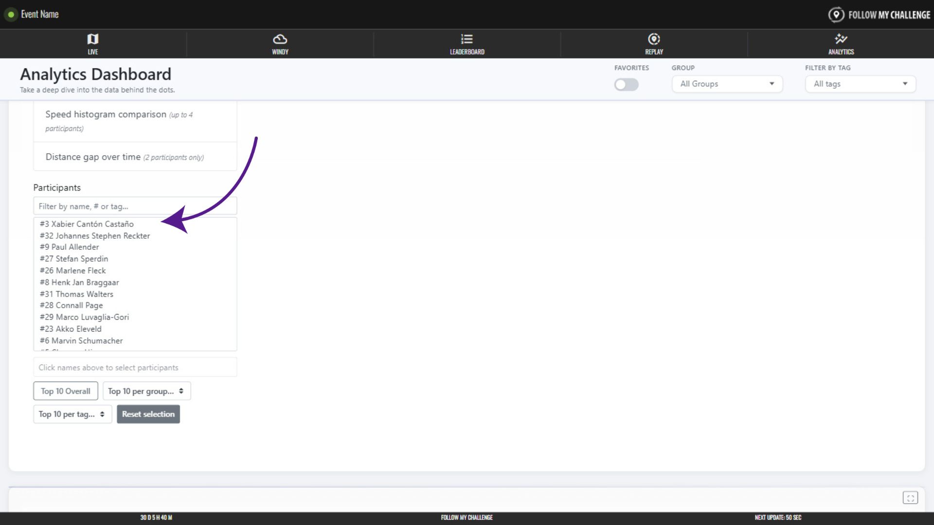
To select participants, click on their names in the displayed list – locating them either by filtering or by scrolling. Available participants are limited to those set by the analytics-wide group or tag filters (if you have these selected).
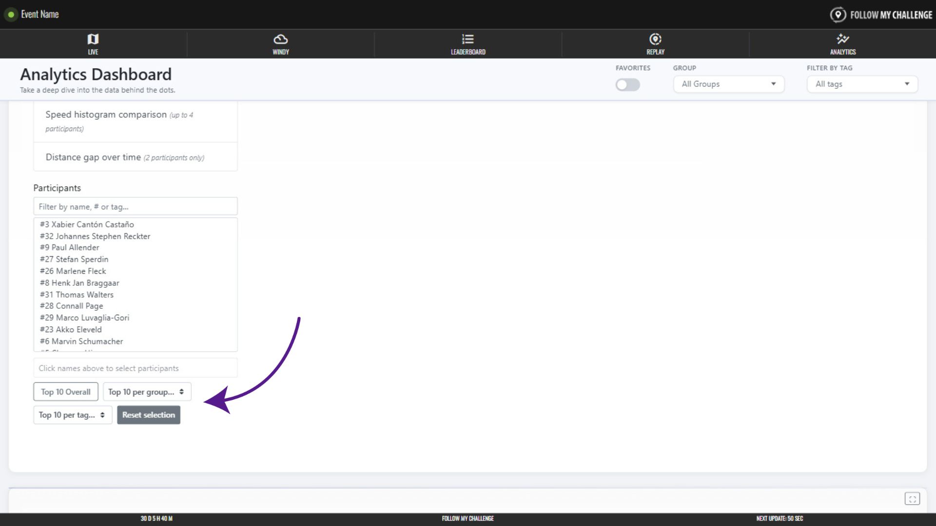
You can also select participants by clicking one of the “top 10” options – allowing you to quickly choose the overall top 10 participants or those within a group or tag.
Graphs generate as soon as a participant is selected. The race flow line chart is the default option. To switch graph, simply click one of the other option on the list.
You will see the selected participants displayed beneath the list of available participants. Simply click the “x” to remove that participant. Or click “Reset selection” to remove all.