Every participant (or team) on the map is displayed as a pin-shaped dot, signifying their most recent location. Above the dot, their name will be displayed and this will be abbreviated to initials if you zoom out.
Some of the participant dots on the map may appear to be semi-transparent, which signifies that their location has not updated for a period of time – by default this is >60 minutes but it can be adjusted. Typically, their tracker hasn’t updated as they are stationary but it is also sometimes due a hardware issue or lack of coverage.
Participant Dot Colours
By default, participant dot colours are randomised, allowing you to more easily distinguish between participants. However, organisers may opt to assign set colours to particular groups or categories within the event. If this is assigned based on a group on the map the you will see the colour displayed next to the group in the details tab (see below).
However, if this is assigned according to participant characteristics that don’t correspond with a group (for example gender in an open category race) then you may have to check with the organiser to understand the significance of the colours. Often these are fairly easy to intuit though and may correspond with assigned participant tags.
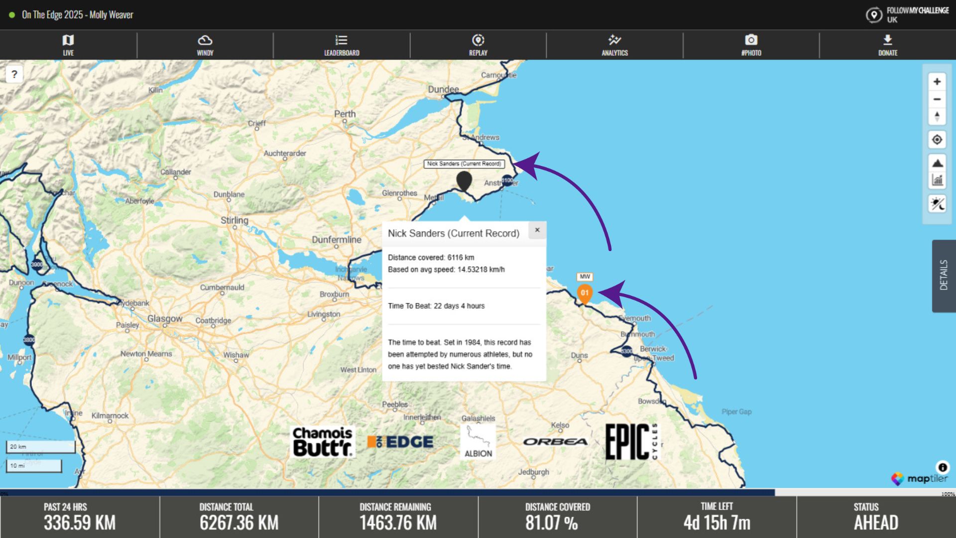
World Record & FKT “Ghost” Dots
Some maps may show a dot based on the record pace for that particular route or world record. These ghost dots follow the route and proceed based on the average pace required to match the existing record. They are not based on real life recorded data, so they will not pause or stop. This means that while participants sleep, the ghost dot will keep inching forwards. But as long as you stay ahead of the ghost dot, you remain on track to beat the record.