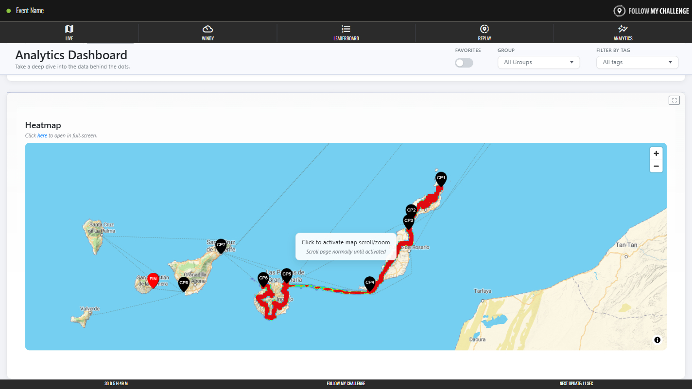
The heatmap section shows all tracker data overlaid on to a map, with heatmapping (red indicates more points and blue fewer) to indicate where participants’ routes have overlapped. This is a great way to see which route choices have proved popular – or to see who has found an inventive/unique route – during free-route events and races.
You can also open the heatmap in its own tab by clicking the link below the heading. Please note that the heatmap contains a lot of data, so it may be slow to load, especially on slower connections or older devices.