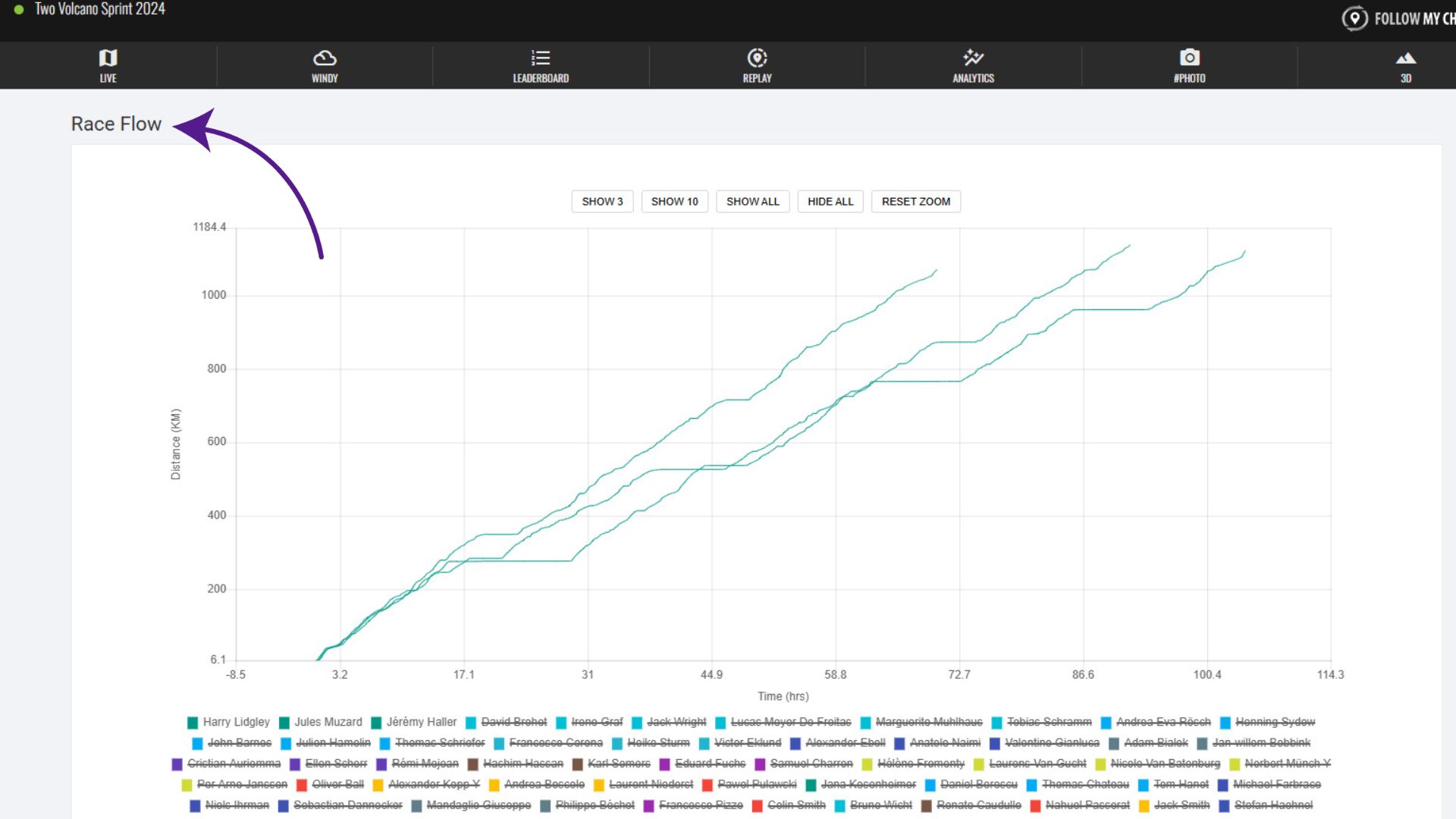
The “Race Flow” section of the Analytics tab displays a graph showing distance over time for each participant, displaying their progress visually. The steeper the line, the faster their progress. Flat lines indicate a lack of progress, usually meaning they’re resting.
By default, the front three participants are displayed, but the buttons at the top allow you to select some pre-set selections. You can also toggle participants on or off by by clicking their name at the bottom of the graph.